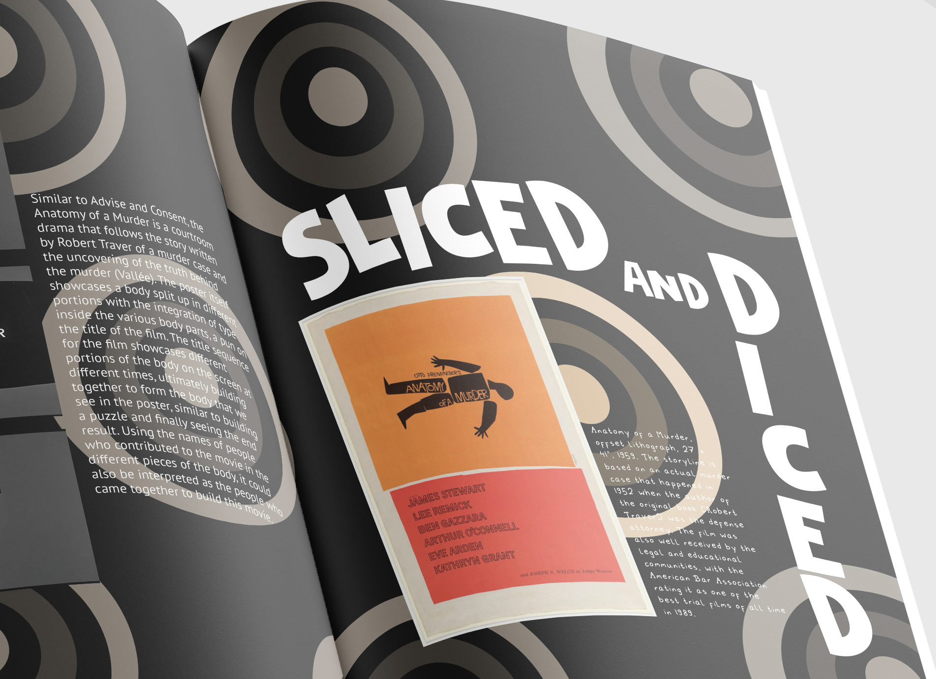
Understanding the history of graphic design is a vital part in understanding design trends and how we got to where we are today. As many people know, Saul Bass was a revolutionary graphic designer known for his signature title sequences and movie poster designs. Through research of his design philosophy, I realized that through simple graphic shapes, Bass creates multiple layers of meaning and highlights the significance of emotion in his designs. This realization became the driving factor behind the design and copy of the booklet.
The copy of the booklet was an essay that I wrote about Bass and his influence on the world of graphic design, highlighting some of his most famous works and explaining how Bass emphasized multiple layers of meaning. As the essay highlights how Bass created meaning from the different layers in his works, I felt like the title “The Second Layer” was a fitting one. This analogy reminded me of an onion and how its many layers make up the whole of the vegetable, much like how Bass’ layers made the whole of his works, so the imagery of the booklet revolved around an onion. To tie the booklet back to Bass’ more known works, his title sequences, I formatted the pages of the booklet like a stop motion title sequence, with each spread becoming a key frame in the overall sequence. As the reader would flip the pages, it would all eventually make sense, as the title page is placed in the back like a grand reveal of the mystery that was what the booklet is about. The typefaces used were inspired by the bold, sans serif type that was commonly found on Bass’ poster designs, with the image captions being displayed in a handwritten font as a nod to Bass using his own handwriting in his designs.


