When thinking about popular chip brands, it can be easy to forget about Sun Chips and their health centered approach to snacking. However, with a rapidly changing food market, it’s important to utilize our health, especially for the next generation. Given this, I wanted to rebrand Sun Chips towards younger audiences to encourage them to eat healthier. To understand why Sun Chips is unsuccessful to its competitors, I researched their current market and found that it was targeted towards the older generation who are health conscious. With this in mind, I wanted to refresh the brand and give it a brighter energy, which is why I chose to focus it towards the youth.
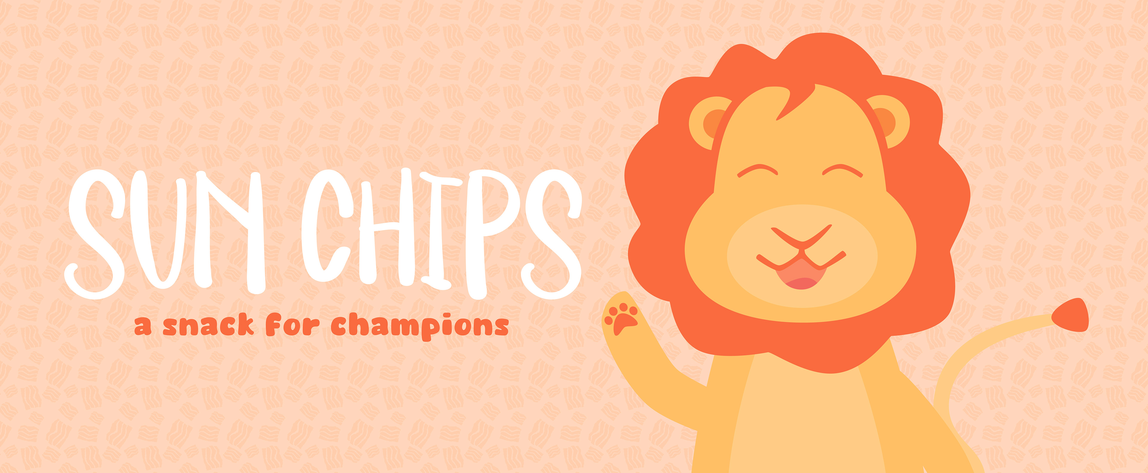
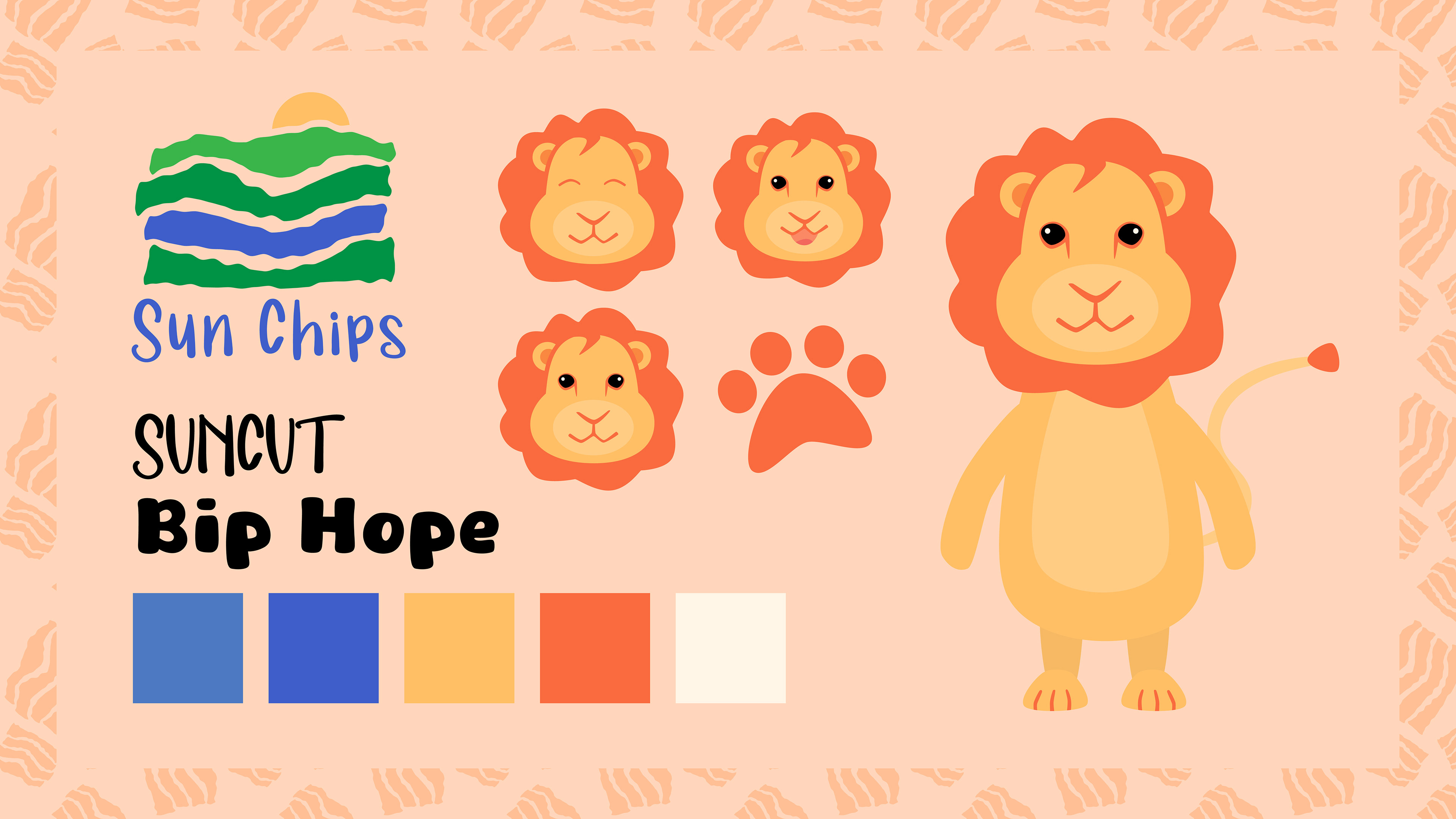
When researching brands that appeal to younger audiences, I found that many of them have animal mascots that are featured on packaging, which led to the creation of Chip the Lion, a new brand mascot. When choosing an animal, I focused on ones with connections to the sun, such as the eagle and the phoenix before settling on the lion. To create a more youthful look to appeal to young audiences, I also chose to create a new, vibrant color palette consisting of oranges and yellows to compliment Chip. A new logo was also designed to match the brand's push towards healthier snacking by utilizing the shape and texture of a sun ship and colors to symbolize a field where the whole grains of Sun Chips would grow.
Sun Chips Variety Pack Packaging Design
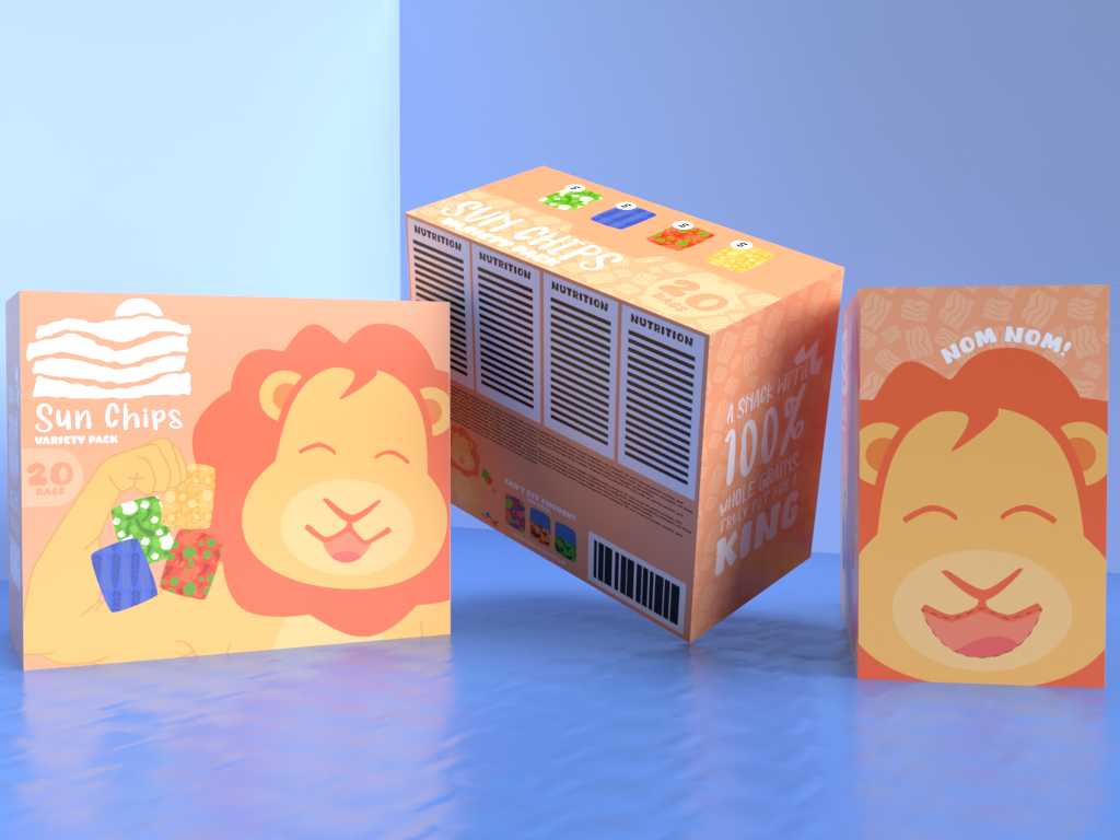
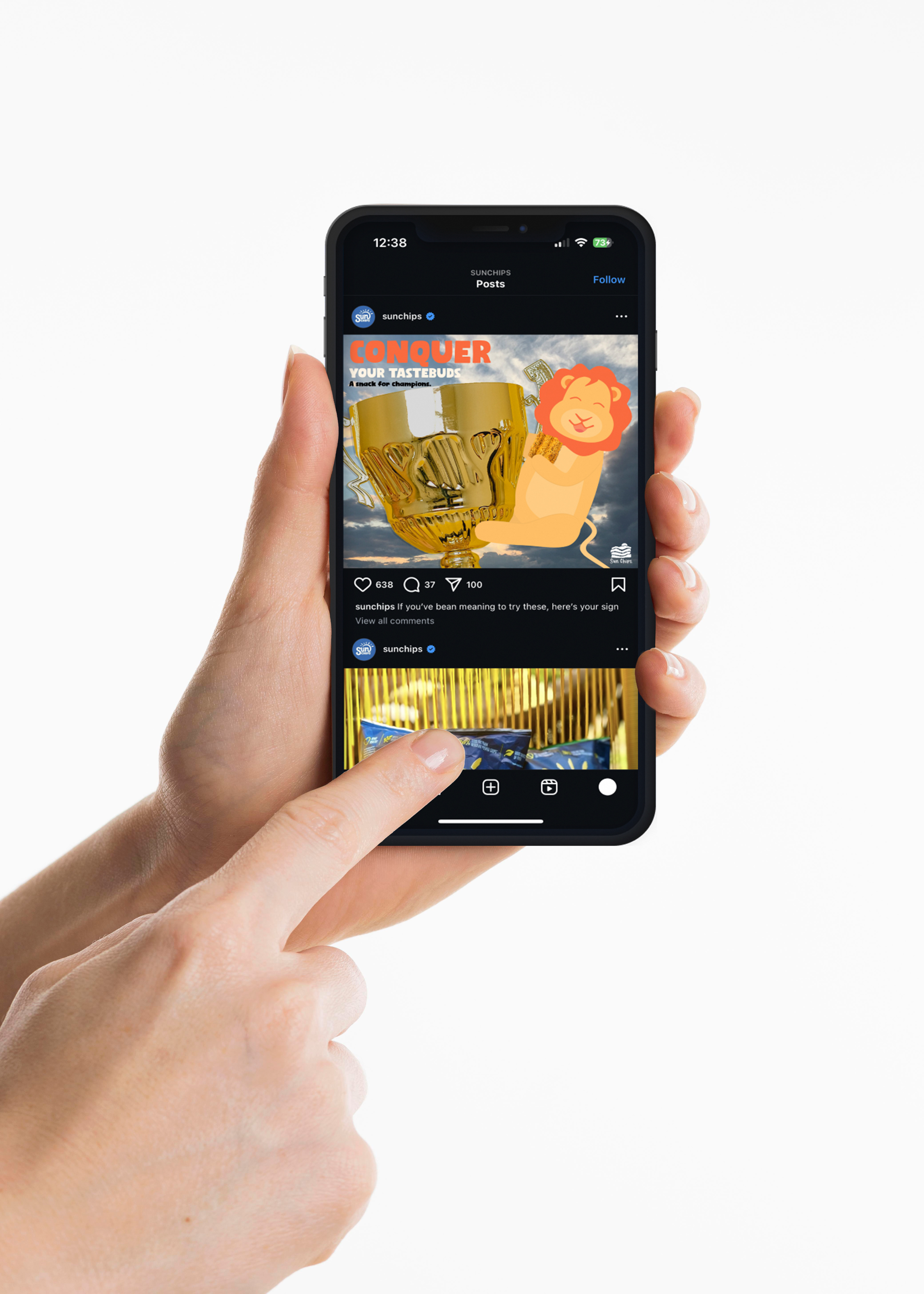
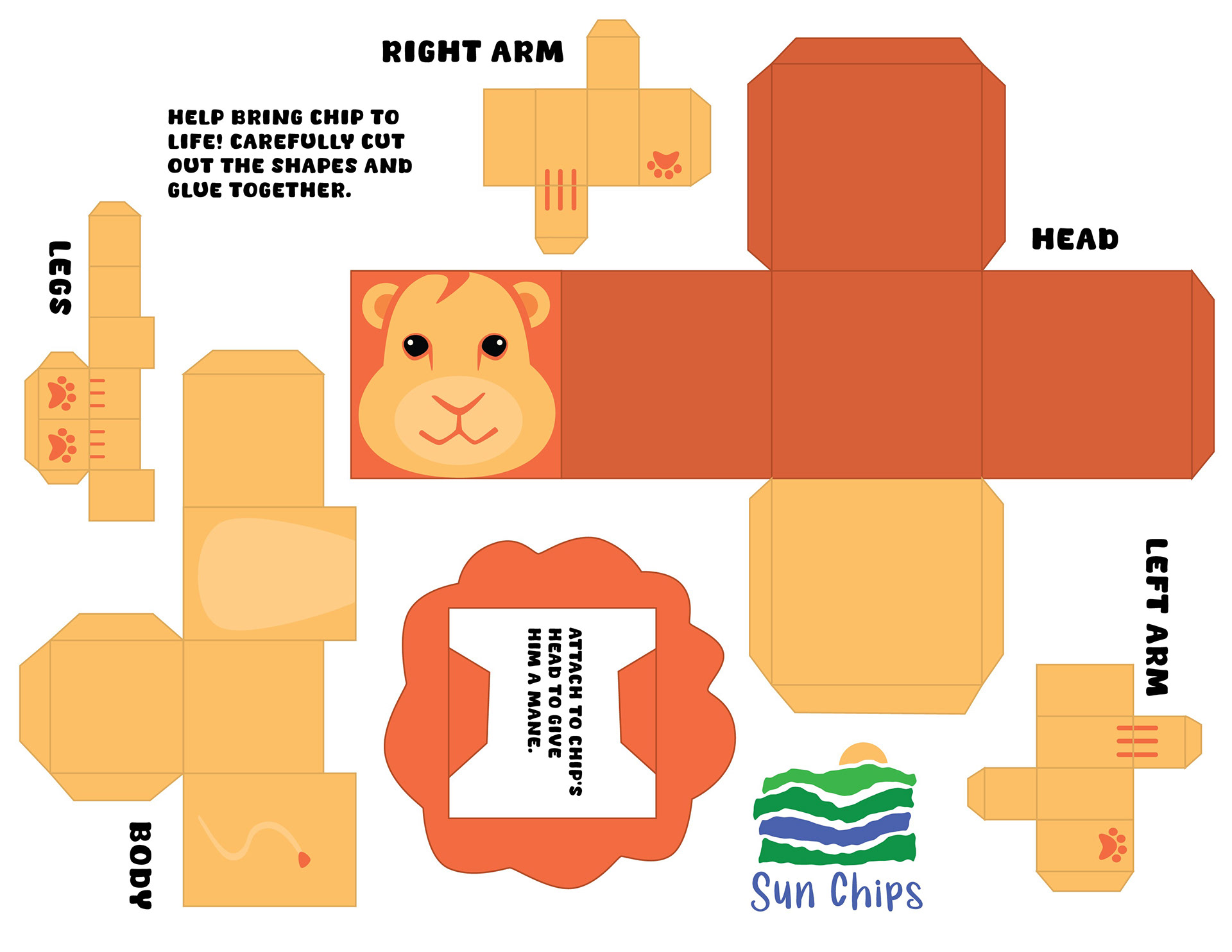
With a new mascot in place, I redesigned the packaging to display Chip and his healthy lifestyle along with a new look for the chips themselves. The variety box of different Sun Chips flavors contains interactive elements, such as Chip’s mouth cut-out and a foldable paper toy inside to grab the attention of a younger audience and encourage them to choose Sun Chips. I also designed a brief ad campaign for Chip to promote Sun Chips as reclaiming the crown as the king of snacks and encourage younger audiences to eat healthier.
Advertising Campaign and Paper Toy Takeaway (Assembled and Printable Sheet)