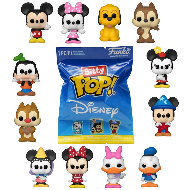
Funko’s POP! Vinyl figures have become a staple of pop culture and are often sought out by collectors due to their distinct style and affordable prices. Partnered with many different franchises, such as Disney, Marvel, and Pixar, you are almost guaranteed to find a Funko POP! of your favorite characters. As the company soared in popularity from their 1998 beginnings, the brand has dispersed into many different iterations of the popular Funko POP! figurines, such as the Bitty POP! line. As the name suggests, Bitty POP! figurines are very small scale versions of the normal ones you know and love, with their miniature size making them even more lovable. Like their larger counterparts, the packaging design follows the same simple colored box with the figurine displayed inside. Even the blind bag packaging for the Bitty POP! figurines consist of simple colors, with some franchises having fun patterns.


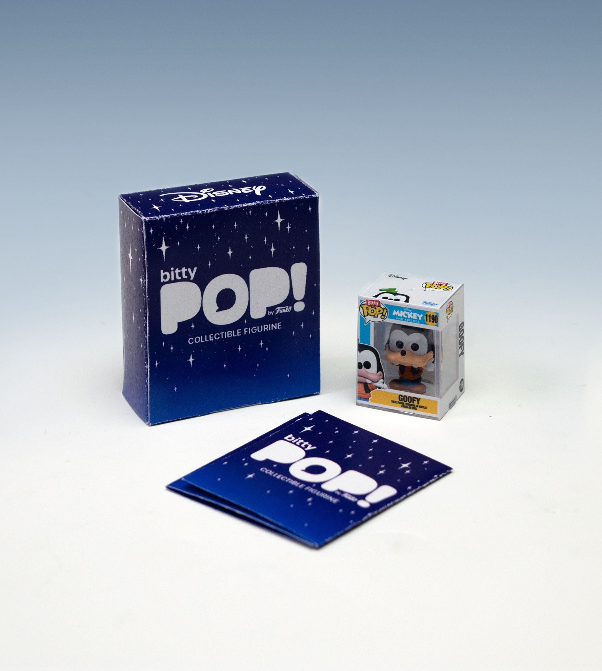
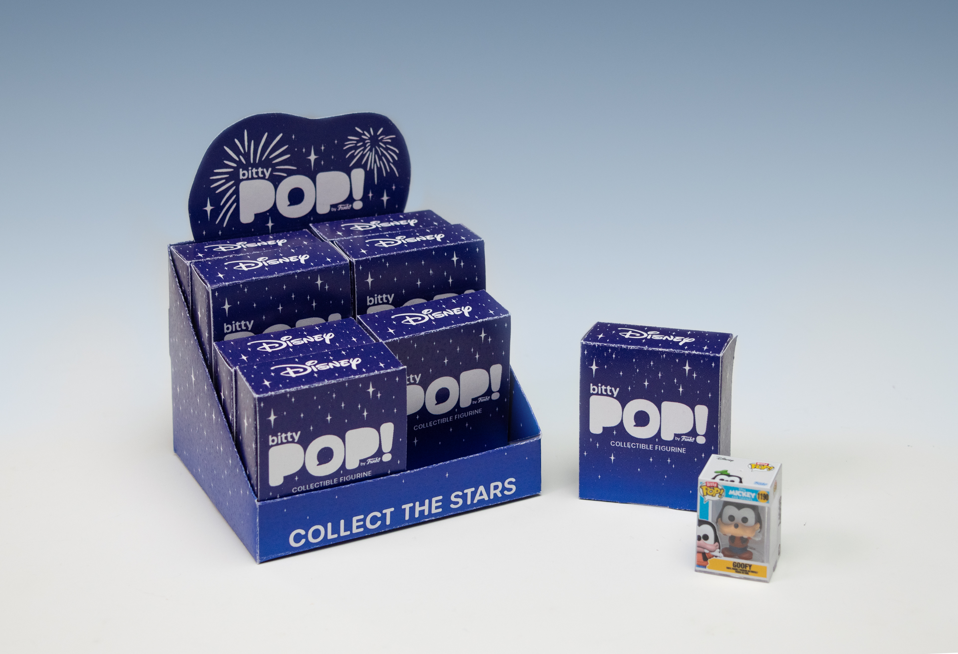
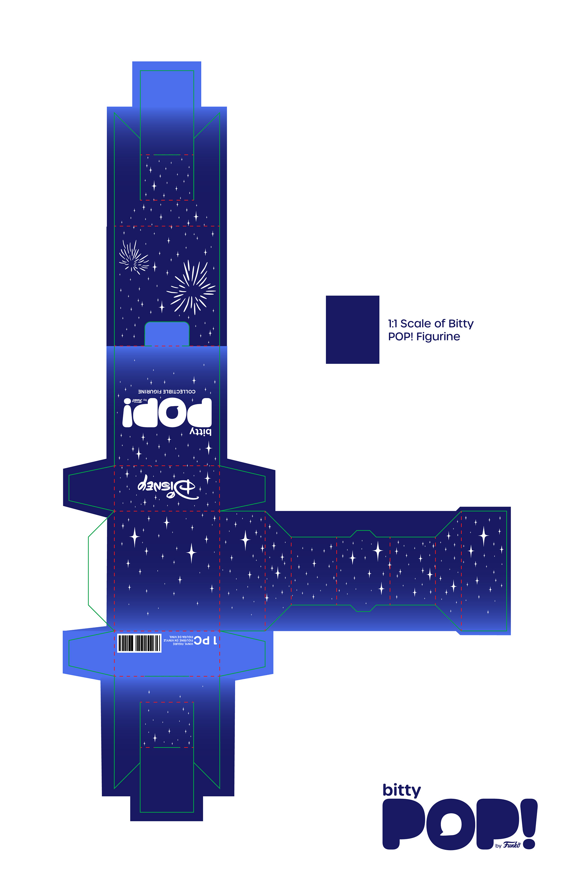
To grab the attention of high-end figurine collectors, this rebrand was centered towards elevating the Bitty POP! Disney edition blind bag to one that was highly desirable, in a box, and nostalgic of old Disney, just like the figurines that are a part of the character line. To start with this, I created a new tuck box die-line to store the miniature figurines inside, taking extra care to give the figurine a snug fit so it felt like the figurine belonged in the box. I iterated many different times, totaling about fifteen prototypes before landing on the perfect box that was an enjoyable experience to open and retrieve the figurine from.
When developing a new brand identity, I started redesigning the logo with the intention that it could be used across all iterations of Funko’s POP! merchandise. Centered around POP!, I used a thick round typeface to mimic the brand’s current logo, but instead of placing it inside a speech bubble, I flipped the hierarchy and placed it inside the “O” as a subtle reference to the original brand. To adapt to any line that Funko could potentially use this branding for, the line’s title can be placed along the top or bottom of the main logo, just like I have done with Bitty POP!


To call on old Disney nostalgia, I researched old product packaging from Disney theme parks, as well as looking at their recent 100 year celebration merchandise that harkened back to the core of Disney. I was interested in their packaging that referenced Cinderella’s castle through the starry night sky as well as the fireworks that Disney is known for, which became the central reference to the new brand identity. A dark blue Disney night sky becomes the perfect setting for the original cast of Mickey Mouse and friends to shine, with the Magic Kingdom’s iconic fireworks lighting up the sky.
Bitty POP! Display and Tuckbox Die-lines


